Remember the Nineties?

This graphic work represents the income disparity in 1990, back then the average US CEO made only 107 times what the average US worker made. That is $2,918,000 to $27,271. By 2007 The average CEO made 431 times what the average US worker took made. The line of figures that come up to the sole of the big CEO’s shoes represents the average US worker for 1990. The largest figure, of course, is the American CEO. The other large figures represent the German, Japanese, French and British counterparts for that same year. This graphic image was created by Christopher Engel in 1992 as part of an Art Prroject on economic statistics and is available in book form. The pages are perforated and meant to be torn out and put together to make this 9 feet tall poster.
The image below, a painting in four panels, measuring 28 feet wide and 7 feet tall was part of the Art Project. It depicts the disparities mentioned above with the addition of Steve Ross (the inset foot with ankle) and Michael Milken, the famous Junk Bond trader (the large foot in the center). The scale of the black figures across the front of the piece represent the 1990 average US CEO and the thin line across the bottom right panel represent the 1990 average worker of the time all according to their incomes which in addition to the figures above were earnings of $550,000,000 for Michael Milken and $78,000,000 for Steve Ross CEO of Time Warner. The full figures would have been way to tall, about 400 feet in Milken’s case to represent the full figure but the foot fits that size figure.

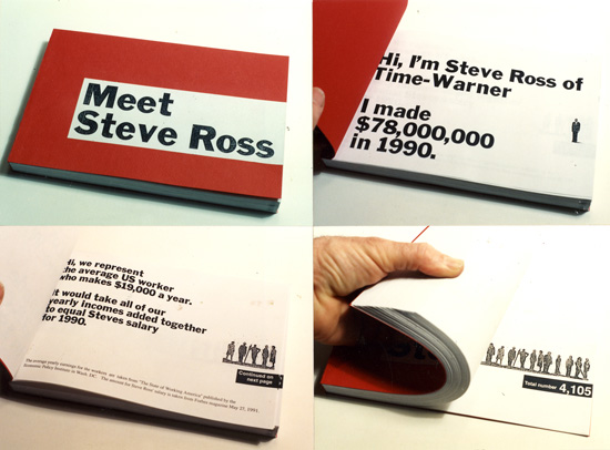
This book illustrate the disparities in income between the average worker and Steve Ross the CEO of Time Warner back in 1990.